Home
About Us
Services
Web Design & Development
Web Design & Development
E-commerce Designing
WordPress Development
Hosting
Mobile App Development
Custom Software Designing
Graphic Designing
Marketing
Search Engine Optimization
Social Media Marketing
Local SEO Services
Softwares
CRM Solution
Fajri Accounting Software
Billing Software
Property Rental Software
Hotel Booking Management System
Portfolio
Blog
Contact Us
Home
»
Portfolios
»
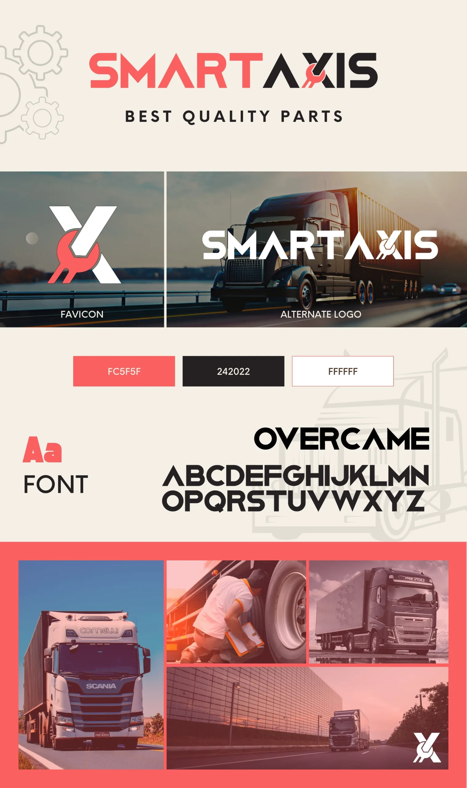
Smart Axis – Logo Design
Smart Axis – Logo Design
Shopping Basket
WhatsApp us
Home
About Us
Services
Custom Software Designing
Local SEO Services
WordPress Development
Web Design & Development
E-commerce Designing
Hosting
Search Engine Optimization
Social Media Marketing
Softwares
CRM Solution
Fajri Accounting Software
Hotel Booking Management System
Property Rental Software
Portfolio
Blog
Contact Us